Designing Digital Experiences that Solve Real Human Problems
Blending empathy, clarity, and problem-solving to create meaningful digital experiences.


Why Work With Me ?
Empathy from Real Healthcare Experience
Clarity Through Strong UX Thinking
Detailed Oriented Visual Craftmanship
Process-Driven, Yet Flexible


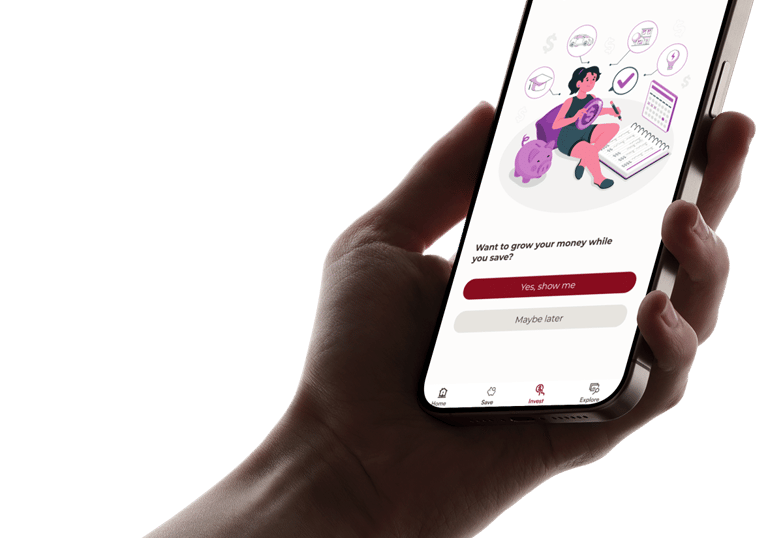
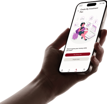
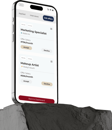
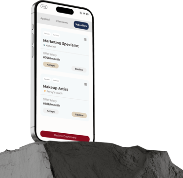
Pillpinger
Overview
Role: Product Designer
Duration: 4 Weeks
Impact: Medication adherence platform for elderly users and healthcare professionals
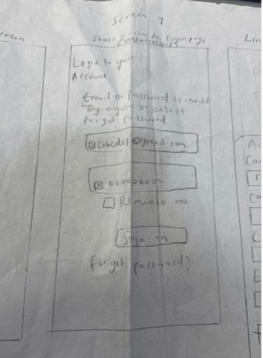
The Challenge
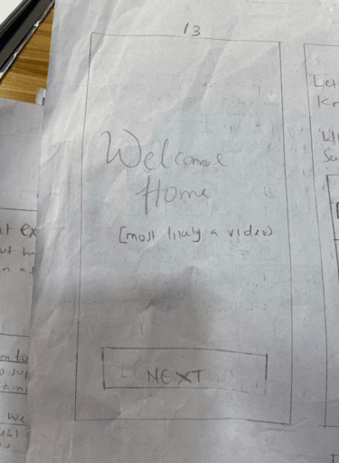
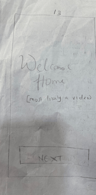
Website Link (Video Placeholder)
Constraint
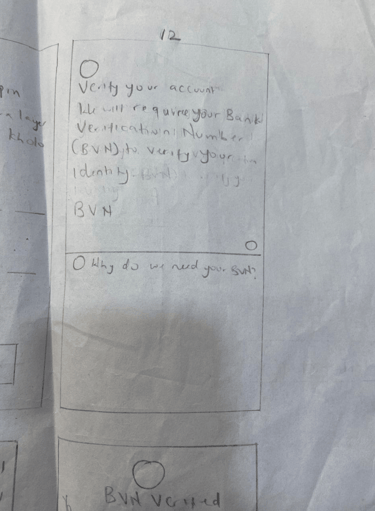
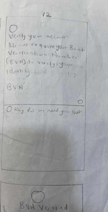
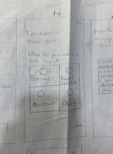
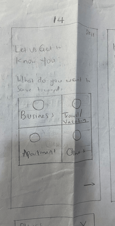
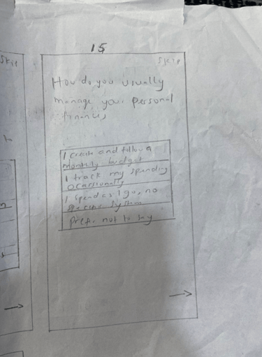
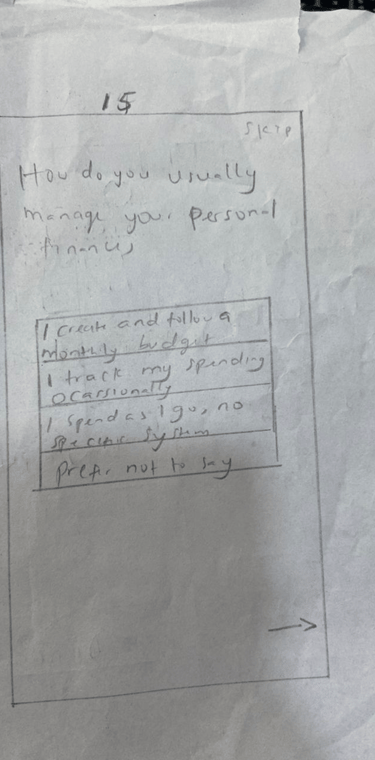
Medication tracking apps often present too much information at once, which can overwhelm elderly users managing multiple prescriptions.
The challenge was to design a simplified, clarity-focused system that reduces cognitive load while maintaining essential tracking functionality.
Pillpinger is a medication tracking concept designed to help elderly individuals manage prescriptions more easily while supporting healthcare professionals in monitoring adherence patterns.
This was a team-based 4-week design sprint where I contributed to UX architecture and interaction flow design.
My Projects
Due to time and user access limitations, we were unable to conduct primary user interviews or live usability testing.
To guide design decisions, we relied on:
Secondary research on medication adherence behavior
Accessibility best practices
My clinical experience working with elderly patients
Key Design Decisions
Outcome
The final prototype presented a more streamlined medication logging flow compared to traditional reminder apps, reducing visual noise and improving clarity of task completion.
Reflection
If continued, I would validate the design through usability testing with elderly users to measure time-to-completion and task error rates.
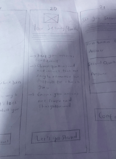
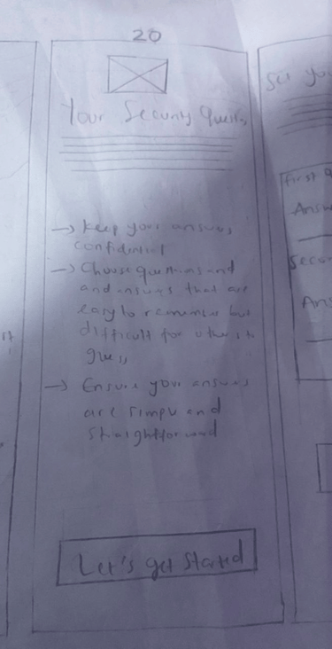
1. Simplified Daily View
Instead of a dashboard-heavy layout, I structured the experience around a clear daily medication summary. This reduced the number of decisions users needed to make at one time.
2. Clear Action Hierarchy
Primary actions such as “Take Medication” were visually prioritized over secondary actions like reviewing history. This minimized interaction friction.
3. Accessibility-Focused UI
Large typography, high contrast color use, and minimal navigation branching were intentionally applied to support aging users.


Movowen Nigeria Limited
Overview
Role: UI/UX Designer
Duration: 2 Weeks
Impact: Simplified navigation and enhanced overall user understanding.
My Role
Without an existing digital presence, the primary challenge was defining:
Clear information architecture
Service explanation hierarchy
Onboarding clarity
Contact conversion pathways
The goal was to design a website that could scale as the company expanded its service offerings.
Website Link (Website Placeholder)
Key Design Decisions
1. Defined Information Architecture from Scratch
I structured the website into clear service categories, ensuring users could quickly understand available internet packages and coverage areas.
2. Simplified Onboarding Flow
Instead of overwhelming users with technical language, I organized content progressively, guiding visitors from service awareness to inquiry.
3. Prioritized Conversion Clarity
Call-to-action placement and visual hierarchy were intentionally structured to support inquiry submission and service interest.
4. Designed for Scalability
The layout and navigation system were built to accommodate future expansion into e-commerce functionality and online subscription management.
Movowen Nigeria Limited is an emerging Internet Service Provider that required a structured digital presence to communicate services clearly and support future growth.
At the time of engagement, the company did not have an existing website. I was responsible for designing the foundational UX structure and interface.
The Challenge
If implemented, the next step would be usability validation and analytics tracking to optimize user engagement and inquiry conversion rates.
Outcome
The final design established Movowen’s first structured digital presence and provided a scalable UX framework ready for implementation.
Although the website has not yet gone fully live, the design serves as the company’s foundational digital architecture.
Reflection
UI/UX Designer
I led the website structure, content hierarchy decisions, and interface design.


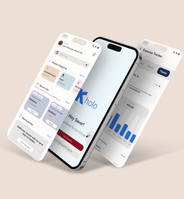
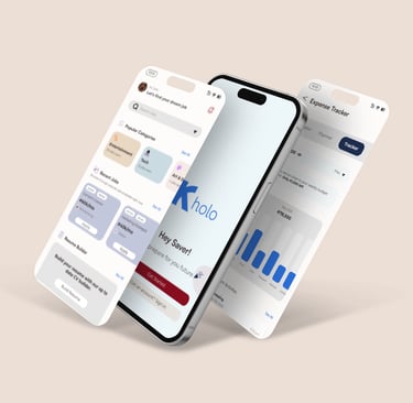
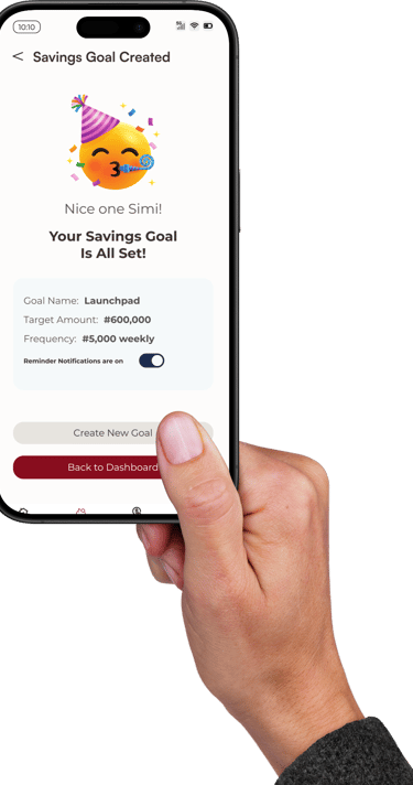
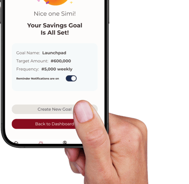
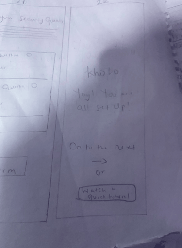
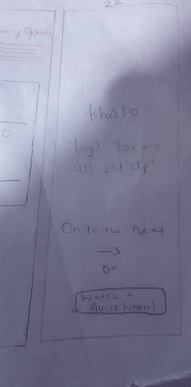
Kholo App
The Problem
The concept was informed by:
Structured survey responses from university students
Two virtual interviews exploring student financial behavior
Insights into irregular income patterns and spending impulsivity
Key insight:
Students wanted structured saving support but struggled with consistency and short-term temptation.
Overview
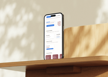
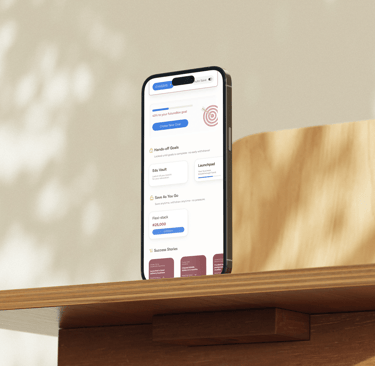
Kholo is a mobile savings and budgeting concept designed to help university students build disciplined saving habits and access funds after graduation.
This project was developed as a capstone product design exercise and involved designing a comprehensive mobile experience across 100+ screens.
Role: Lead Product Designer
Duration: 6 Weeks
Impact: Turns inconsistent saving habits into a structured lifestyle.
Student Savings & Budgeting Mobile App
Research
Many students lack disciplined saving systems and withdraw savings prematurely due to lack of accountability structures.
The challenge was designing a product that:
Encourages long-term saving
Reduces impulsive withdrawals
Makes budgeting feel simple rather than restrictive
My Role
Product Designer
I led feature architecture, user flow structuring, and interface design across the full product ecosystem.
Key Design Decisions
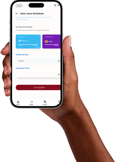
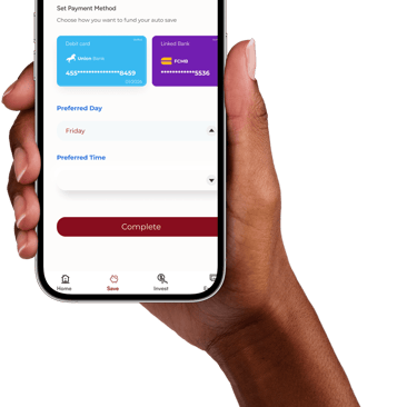
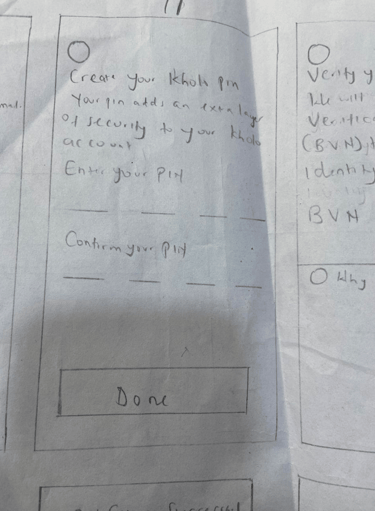
1. Graduated Savings Lock Mechanism
Designed structured savings tiers that discourage premature withdrawals while maintaining user autonomy.
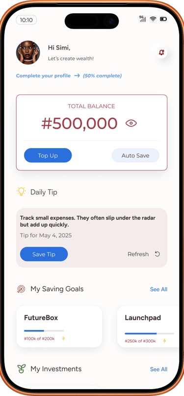
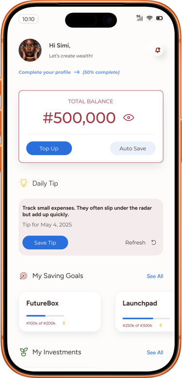
2. Clear Budget Dashboard
Structured spending visualization to simplify monthly budgeting and increase financial awareness.
3. Behavioral Nudges
Integrated reminder patterns and progress indicators to reinforce saving behavior.
4. Scalable Feature Set
Designed over 100 screens, including onboarding, savings plans, withdrawal logic, budgeting dashboard, job opportunities for students, discounted deals, transaction history, and alerts.
Outcome
The final prototype demonstrates a full product ecosystem with structured financial behavior reinforcement.
If continued, the next step would involve usability testing to measure retention and savings commitment rates among students.
Over 100 Screens
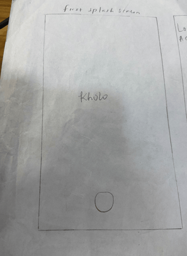
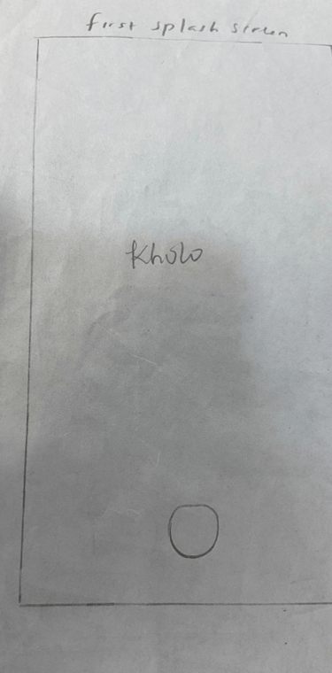
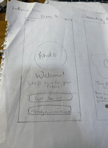
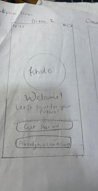
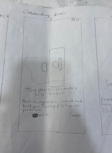
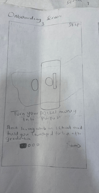
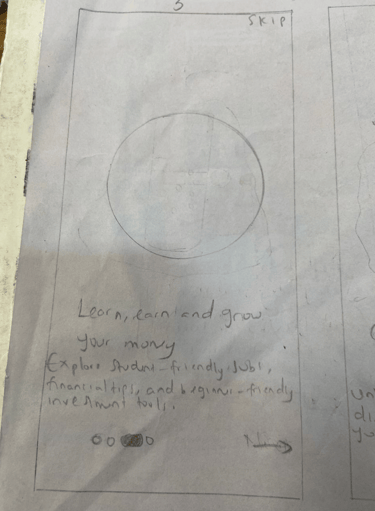
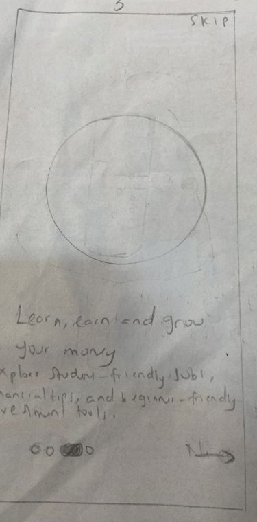


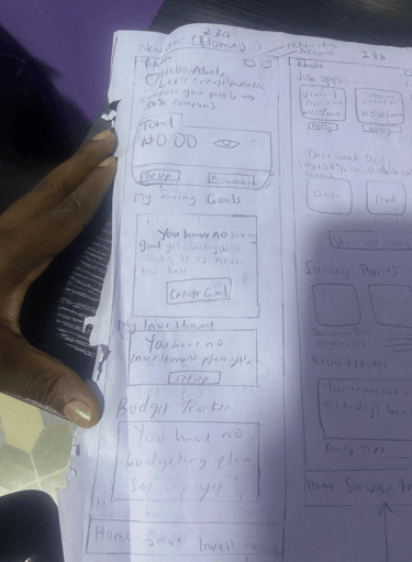
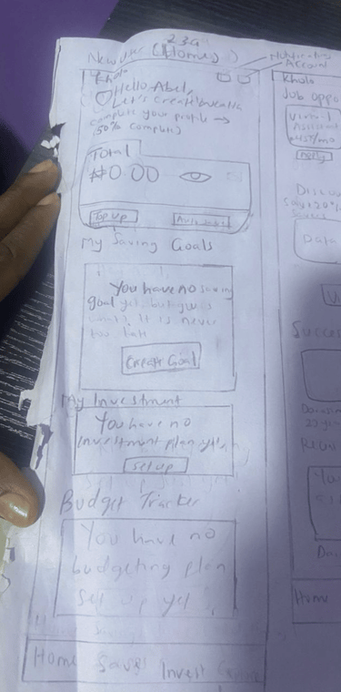
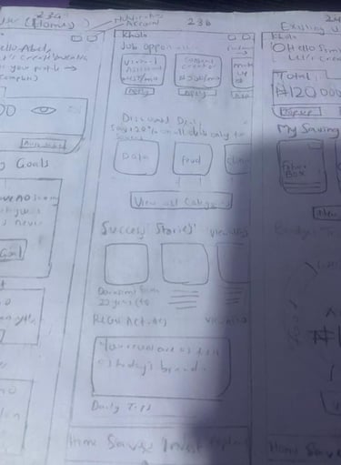
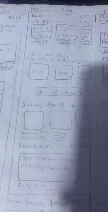
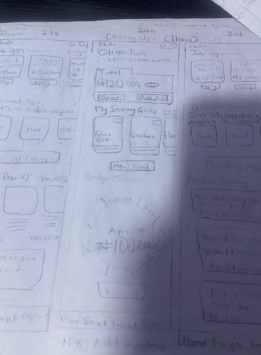
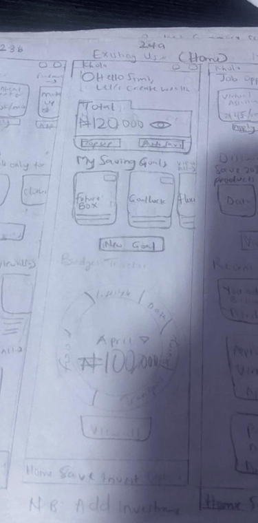
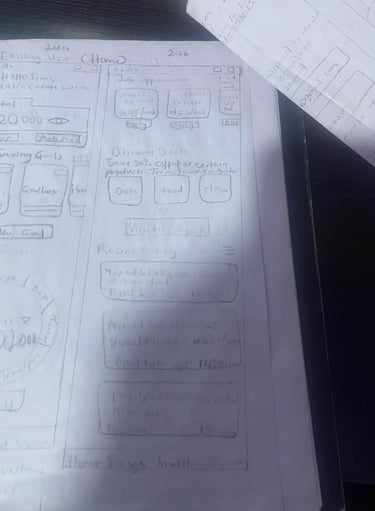
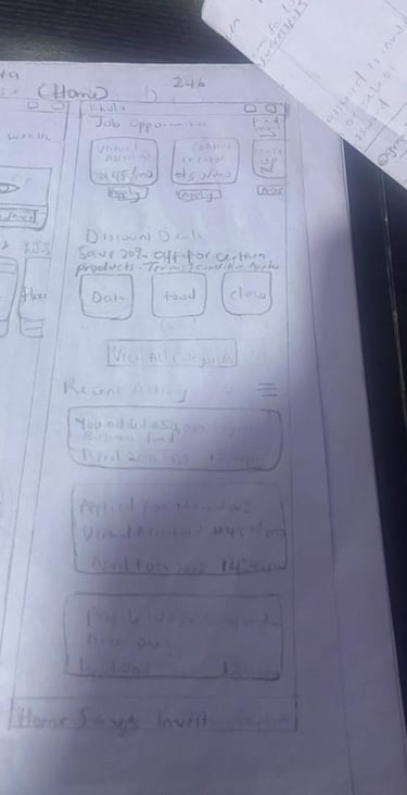
Splash & Onboarding Screen
Signup Screen
Onboarding Questions Screen
Dashboard Screen
Design Process


Affinity Mapping
Grouped themes around procrastination, lack of routine, and financial anxiety.

User Personas
"The Overwhelmed Student", "The Budget-in-the-Head-Saver", "The Aspiring Planner".


User Flows
Focused on fast setup, easy tracking, and emotional reinforcement.
Color & Typography
Aa
Aa Bb Cc Dd Ee Ff Gg Hh Ii Jj Kk Ll Mm Nn Oo Pp Qq Rr Ss Tt Uu Vv Ww Xx Yy Zz
Monteserrat
Aa
Aa Bb Cc Dd Ee Ff Gg Hh Ii Jj Kk Ll Mm Nn Oo Pp Qq Rr Ss Tt Uu Vv Ww Xx Yy Zz
Satoshi
Empathy Mapping
The Overwhelmed Student,” “The Budget-in-the-Head Saver,” and “The Aspiring Planner.


Empathy Mapping
Identified fears around “emergency spending” and “budget collapse.”
Primary Color
Secondary Color
Tertiary Colors
Neutral Colors
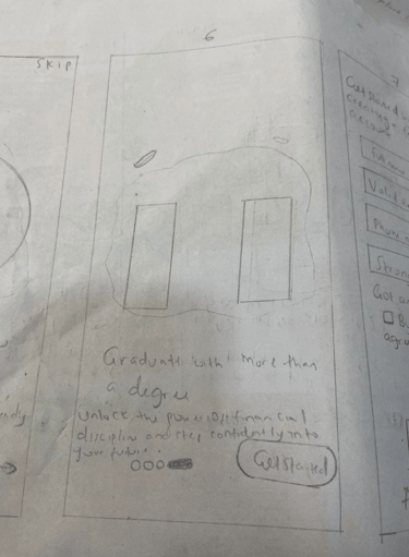
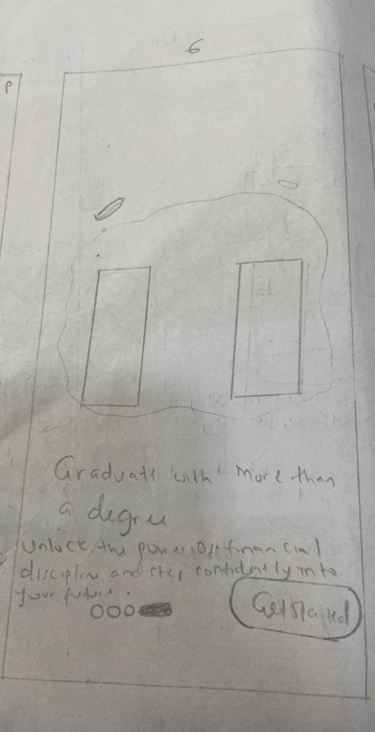
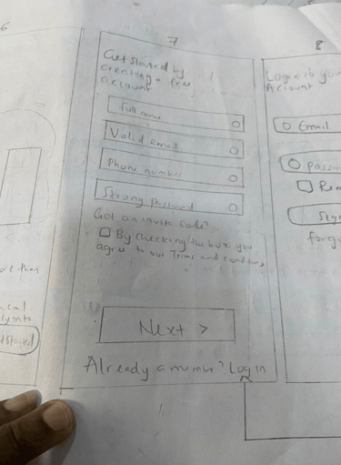
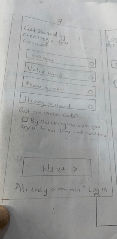
Vaxicare
Problem Statement
Managing maternal and child health information can be overwhelming for many mothers, especially when relying solely on paper vaccination cards, verbal instructions, or fragmented notes. Important details like vaccine dates, medication routines, growth records, and clinic appointments are often difficult to track consistently. This creates anxiety, confusion, and increases the chance of missed healthcare milestones.
To better understand the challenges and explore a more structured solution, I created mid-fidelity wireframes to visualize how a digital platform could simplify this process. The goal was not to design the full product but to explore the user experience and layout of core features, and demonstrate how an organized digital system could support mothers more effectively.
Project Summary
Role: Lead Product Designer
Duration: 2 weeks
Domain Strength: Nursing + Health-tech
Impact: Better adherence to vaccine timelines and reduced stress for mothers.
Solution
I designed a set of mid-fidelity web wireframes (6 pages) along with a few feature screens to illustrate how Vaxicare might function as a centralized maternal and child health tool. These wireframes focus on clarity, easy navigation, and reducing information overload.
The design exploration includes:
A clean timeline-based structure for vaccines
A simplified layout for medications and health records
A calm, straightforward navigational flow for essential features
Light grey-scale screens that allow focus on information architecture rather than visuals
This exercise demonstrates my approach to problem framing, UX thinking, and early-stage structuring of a health-focused product.


Vaxicare helps mothers manage vaccines, medications, growth metrics, and health records for themselves and their children. I combined my healthcare knowledge with strong UX thinking to design a simple, safe, and reliable tracking system.